We all know that your website is a representation of your company. It’s your digital business card. Therefore, any MSP should invest time, effort and money into creating a solid online presence that starts with their website.

Key elements that the best MSP websites should include are:
- Original content
- Simple understandable design
- Easy navigation
- Overview of service offerings
- Free information in exchange for a lead
- Promo video
- Benefits for customers
- Free services
- Pleasant design, graphics and colors
- Social proof
- A blog page
- Strong About Us page
- Pricing estimation
- Call to action
There are so many elements that go into a high-converting website design. Unfortunately, many MSPs fail to implement even the most basic ones. In this article, we will have a look at the key features of a successful website, as well as review the best examples in the MSP space.
What elements do the best MSP websites have?
Your site is the first impression you make on visitors and it impacts whether or not they decide to work with you. So here are the main elements an MSP website should implement to turn them into clients.
Original content
A good MSP website has original and personalized content. Its main goal is to share the company’s values, approach, personality and benefits. An MSP must clearly define their goals as well as establish the perfect client profile.
Values and benefits can be summed up in short sentences. Other content on your site should be original, purposeful and optimized for search engines.
Most importantly, everything must be specific for your target audience.
An MSP website must communicate its unique elements that no other competitor has. Emphasize any specific offer, industry, area of operation or anything else that makes it clear that there is no other MSP like yours.
The best MSP websites also tend to have a distinct look and feel that reflects their individual approach and personality with text that is informative and easy-to-read.
A simple and understandable design
Your site design plays a supporting impactful role. It’s always recommended to hire a professional developer or use a theme builder for a more personalized and unique solution.
The main rule of the design is to keep it simple while maintaining interesting and unique sections that are spaced generously for ease of reading.
Highlight the benefits for customers
The content of all MSP websites should emphasize value that potential customers won’t find anywhere else. Benefits must be located in eye-catching places so that visitors shouldn’t have to scroll down to see them.
Easy navigation
Your website should be easy to navigate. People don’t have the time and attention span to search for your phone number or social media buttons. And when we say they don’t have time, we are talking about seconds! So place all important elements as the main tabs in the header menu and the second most important details should be placed as categories or in the footer menu.
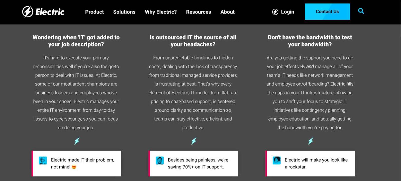
Social proof
Social proof is the most powerful and relatively easy way to make a positive impression on website visitors. By utilizing your past experience and online channels, you will convince people that your MSP is a trustworthy partner. Social proof can be presented in different ways on the website such as:
- testimonials
- case studies
- reviews
- ratings
- customer’s quotes
Probably the most effective way to establish trust with visitors is to have a testimonials section on your website’s homepage.
The best type of testimonial is a video. You can ask your clients to record a short video review. You can then edit it with some music and text to turn it into high quality content. MSPs can also showcase a customer satisfaction score.
Testimonials are especially of high importance when it comes to the B2B space because one of the first things a site visitor wants to see is proof of happy clients.
If you want to go to the next level of social proof, consider creating a detailed case study where you describe how you solved problems for clients.
Eye-Catching Headlines
The headline on the MSP website is the most important content piece for the business. According to statistics, the average user spends less than five seconds on the homepage before deciding whether they’ve found what they need. So use these seconds carefully and deliver your pitch effectively.
MSPs should make the best impressions possible with a strong headline that clearly demonstrates the value of their offering. It should speak to the benefits of the services with action-oriented statements.
Overview of service offerings
This element is probably understandable for everyone. Your website should have a clear overview of the services you provide and their benefits for clients.
Offer free information in exchange for a lead’s information
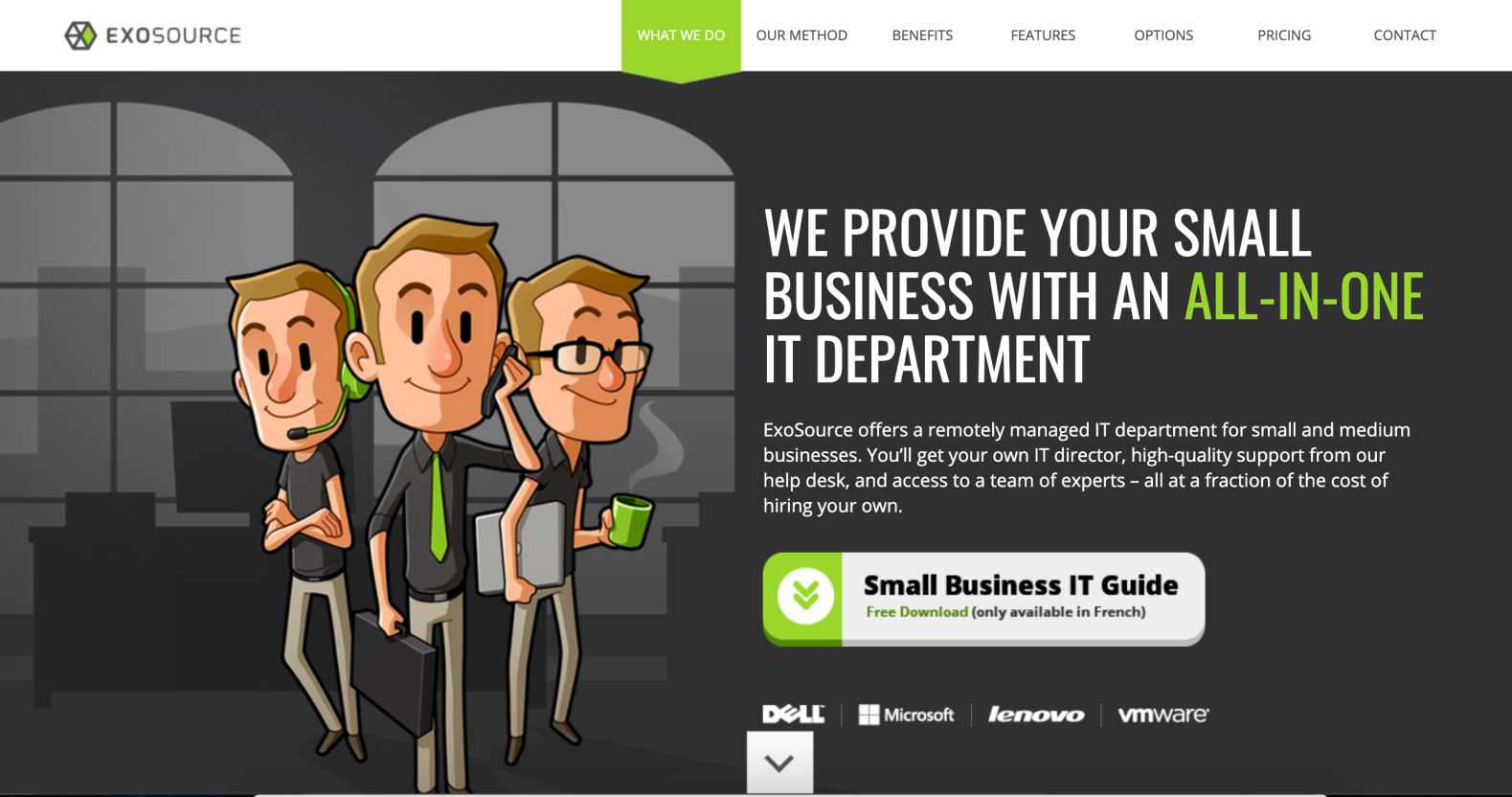
A website might want to collect leads in exchange for a free downloadable product or some other perk. This is often referred to as a lead magnet as those who collect the download can be converted into a paid customer with some marketing.
For example, MSP website Exosource cleverly offers a visitor to download a small business guide. They don’t however ask for any information in return, which provides value to the client but doesn’t do much for the MSP. We highly recommend requesting at least an email in exchange.
Contact information in the header
The best MSP websites make sure their contact information is super easy to find by having it in the header. This can include a phone number, address, email, “Call” button, or “Contact Us” message. Visitors shouldn’t experience any difficulties in finding such information.
Add a promo video
Promotional videos are powerful in giving an overview of your company, its values and its services. It should be a high quality film or a well-made animation.
Offer free services
A free service, such as a consultation or a network assessment, can lead to a paying client. Yes, this will require some effort and time from the MSP’s side, but it can result in a good ROI.
Pleasant design, graphics and colors
Don’t forget about being pleasing to the eye with important design elements like colors and graphics. Create a consistent brand color scheme and visuals to appeal to the visitor.
Also try to keep website pictures original and avoid free stock photos. If you don’t have your own photos, perhaps the use of graphics will make more sense.
Add a live chat
Live chat is a great tool to provide quick responses to visitors and turn them into leads or clients. This makes your site visitor feel like they have quick access to you and your solutions.
Add social media
Social media isn’t used very actively in the MSP space but it doesn’t mean you can’t benefit from it. Having a profile on LinkedIn is a must for everyone, but it’s even cooler to communicate to your community with content on YouTube, Instagram and Facebook.
All links to social media should be included in your website layout, ideally in the header and footer. Your online presence will really help you establish trust.
Consider having a blog
Blogs are great marketing tools for your company as they provide additional value that gets into the nuances of your industry. Make sure your posts are optimized for Google search so that you can generate leads from organic traffic. This also creates opportunities for visitors to engage with your content and share it on social media.
Have a Strong About Us page
The second most important page on your business website is of course the About Us page. Visitors need to know a company’s differential elements, its history and values.
Your About Us page should include:
- Your vision and differential factors
- Team and executives
- Experience in the industry
- Unique value proposition
Don’t forget that all pictures must be representative and of high quality.
Pricing estimation
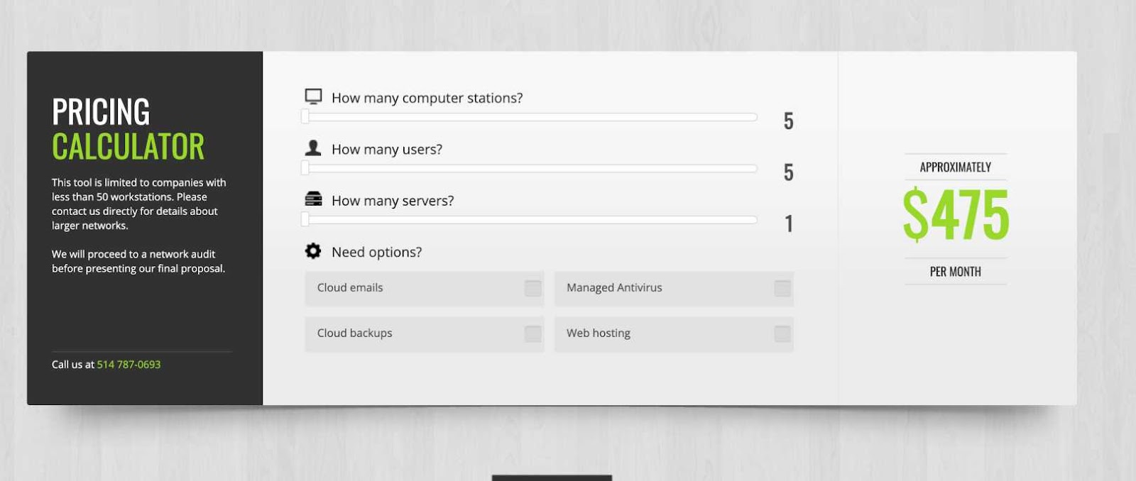
The best MSP websites include a price calculator. With the help of this tool, visitors can instantly see if your services fall into their budget or not. Most MSPs hide their pricing from potential clients and request a call or email to get more details, which is why having this will help you win over the competition with transparency.
Add call to action
A call-to-action (CTA) is the key driver of leads on your website. It must be placed in a visually appealing position close to the main headline of the homepage. The CTA button must be clear and should entice your visitors to click. The actual button link should take a visitor to the contact form or another conversion landing page.
The right structure of the MSP website
The classical MSP website should have the following structure (starting from top to the bottom):
- Customer benefits
- Social proof
- Expectations (what potential clients can anticipate working with you day-to-day)
- Technical information
Examples of the best MSP websites
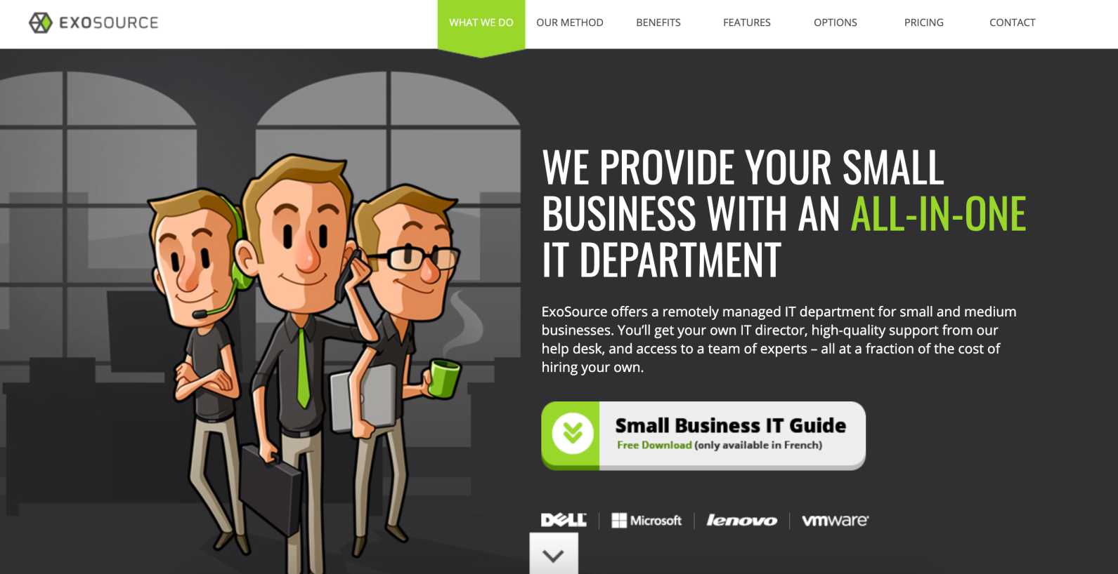
Remarkable elements:
- Very sleek design
- Easy to understand
- Downloadable comprehensive guide for small businesses
- Smooth navigation
- Benefits for clients and pricing tabs in the header menu
- Pricing Calculator
We especially like their ease of navigation and clear information about the company. A visitor can scroll down and read about their methods, benefits, features and solutions step-by-step. Right after the price estimation, you can see contact information in a large font size so that a visitor can take action immediately.
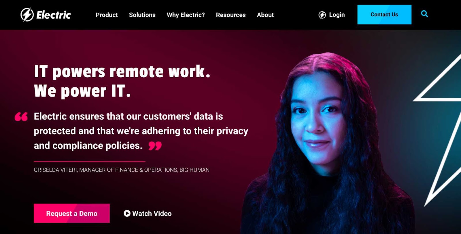
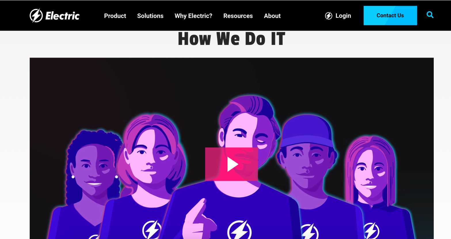
Remarkable elements:
- Personable design with people’s faces and quotes
- Video-centric
- Contact us button in the header
The strongest differentiating point of this website is its great video presentation. Despite using an animation instead of a classic video with people, it perfectly translates the company’s goal, values and benefits.
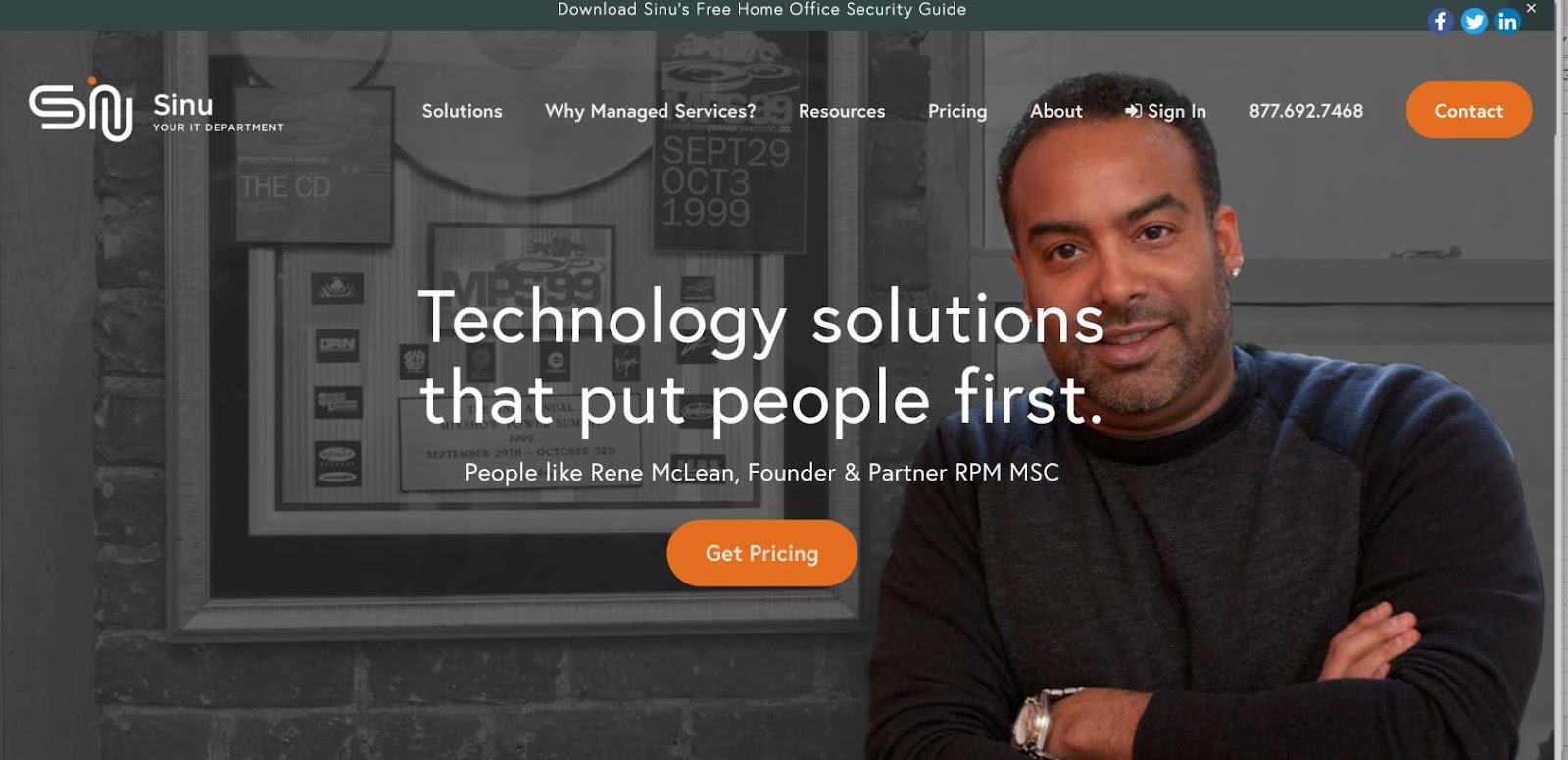
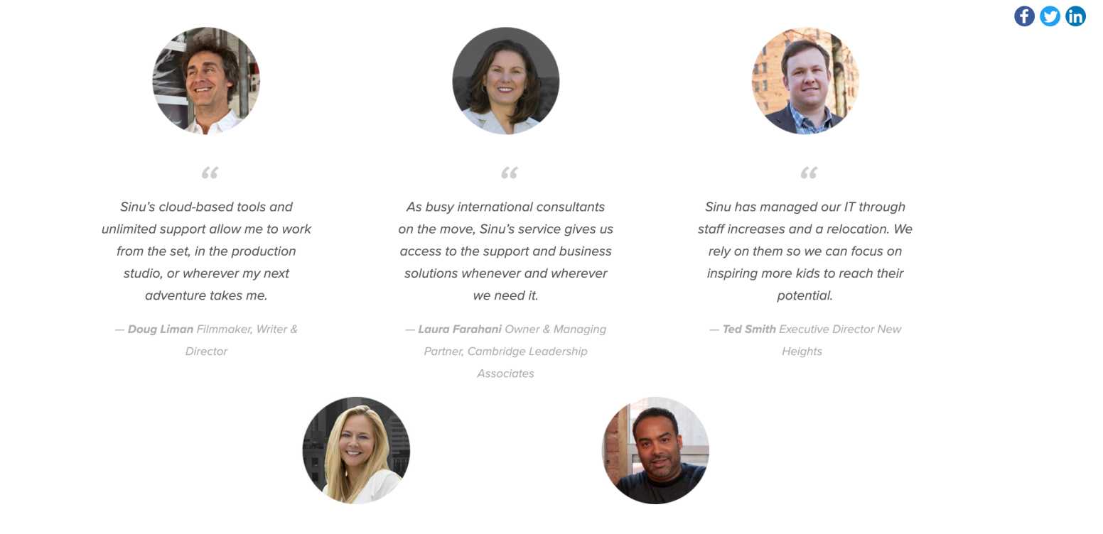
Remarkable elements:
- Simple and understandable design
- Contact and social media buttons in the header
- Presence of customer testimonials
Sinu does a great job highlighting client testimonials.
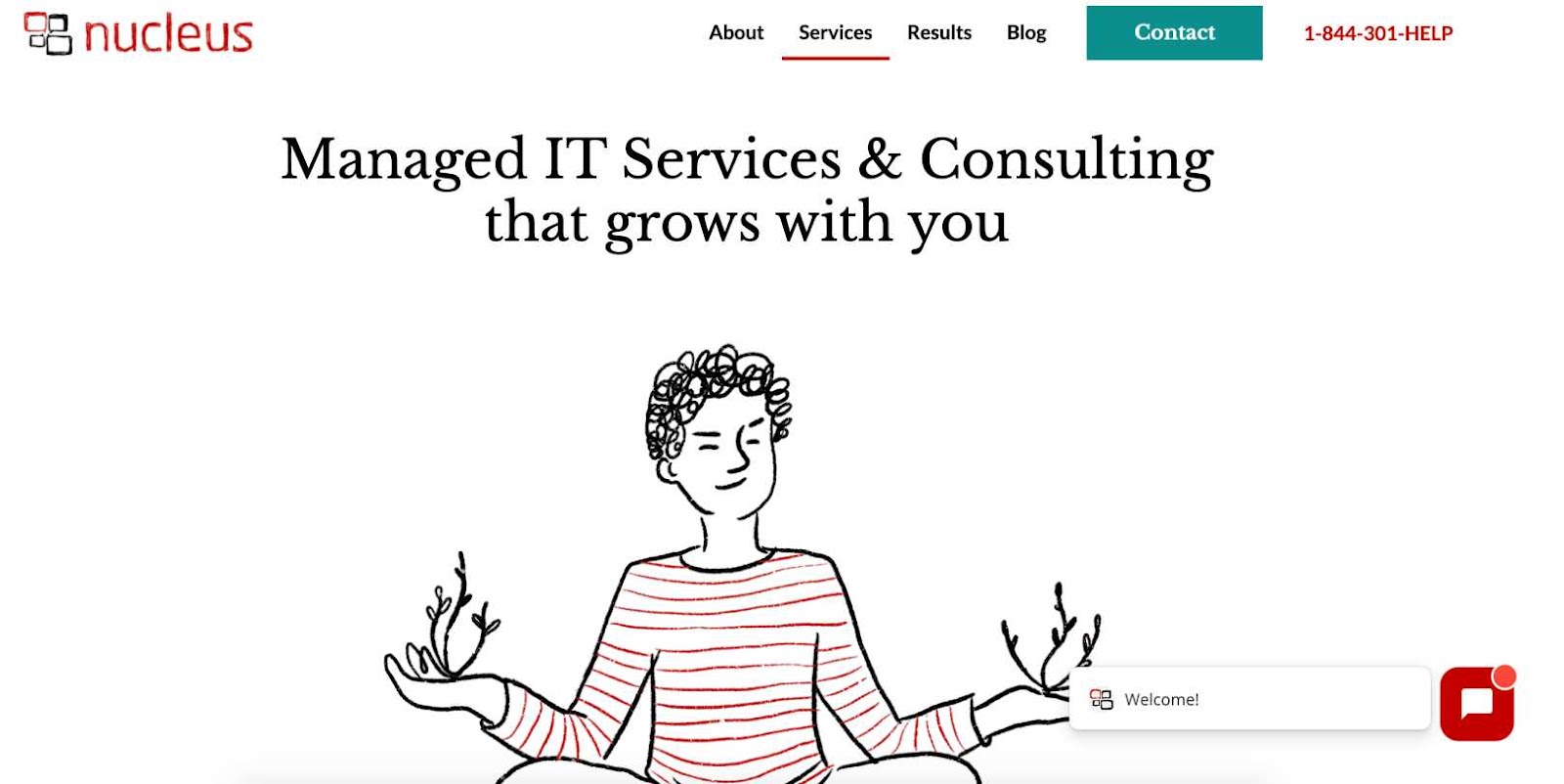
Remarkable elements:
- Very unique, creative design
- Easy to remember and navigate
- Has an organic vibe
- Live chat
- Pleasant color scheme
- Social media buttons in the footer
The design elements of Yournucleus definitely stand out from all the other examples. It’s very creative and artistic, which is very atypical of how tech sites usually look. That’s why it can also have a negative effect. We think it’s cool, but other potential leads may find it too foreign for them to feel comfortable with it.
Other good examples of MSP websites:
Enjoyed reading this article and need more insight on best practices for your MSP? Feel free to reach out to us and build your team with Support Adventure which can help you scale and reach your goals.


0 Comments